
WAKE
Branding Project
This was a project for the Branding and Communications class at Lake Washington Institute of Technology's Bachelors of Applied Design Program. The goal was to create a brand for a hypothetical company, called wake, that was the result of a merger between T-Mobile, Starlink, and B-Corp principles.
RESEARCH & STRATEGY
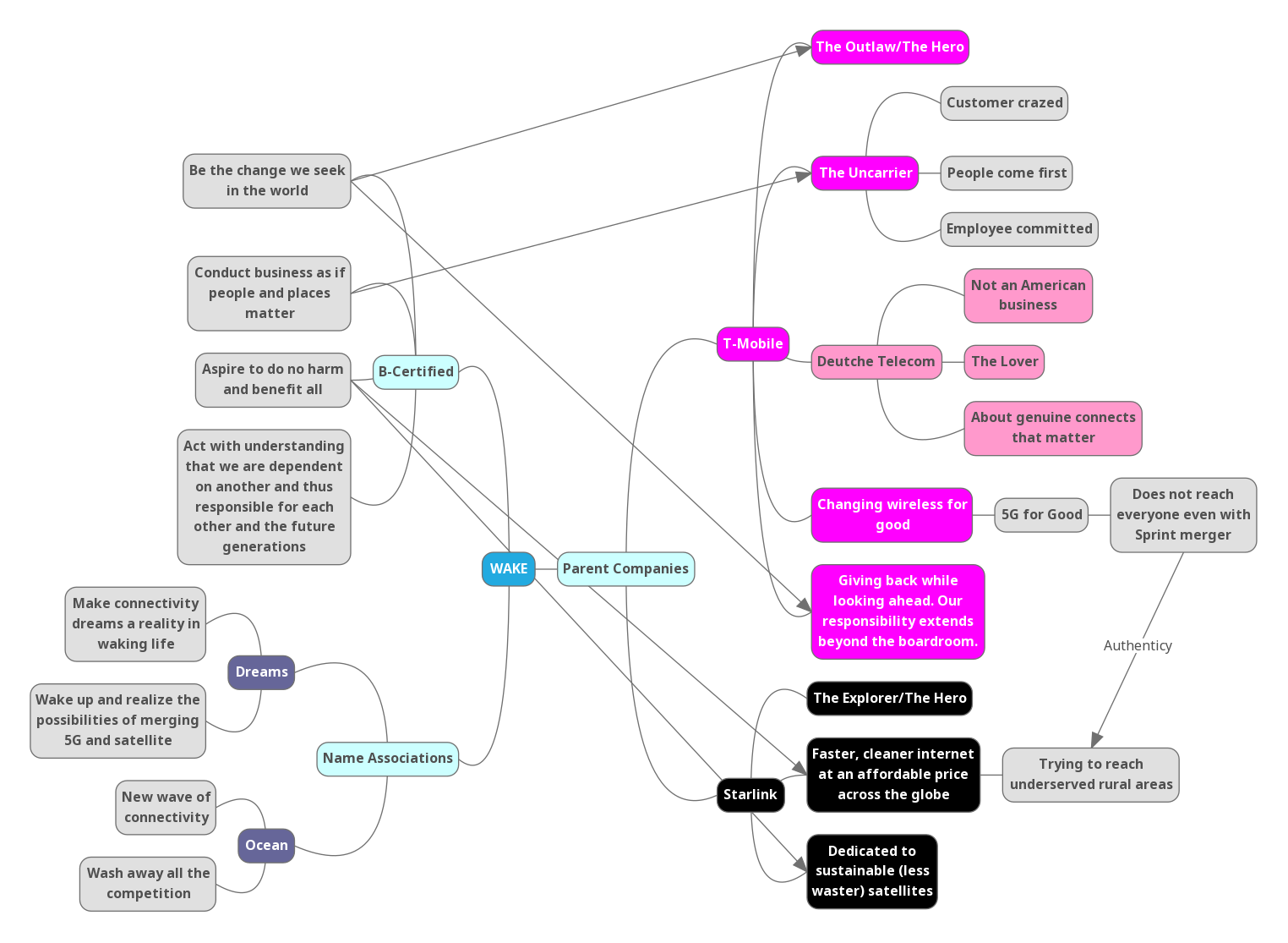
Mind Mapping
To start the project I tried to identify what core aspects of the parent companies from the merger made them strong and should be carried into the wake brand. I also looked at associations between the name and what could make the new company stand on its own.
Brand Strategy Guide
The culmination of my initial research and brand development was a strategy guide that defined what wake stood for, its personality, how it could differentiate, and suggestions for the identity development going forward. All branding work from here on used the brand strategy as a guiding principle for decision making.
IDENTITY DEVELOPMENT

Logo Sketches
Logo creation was the next step for the identity development of the wake brand. Using the brand strategy as a guideline, I sketched a variety of rough logo ideas, which were then peer reviewed and narrowed down.
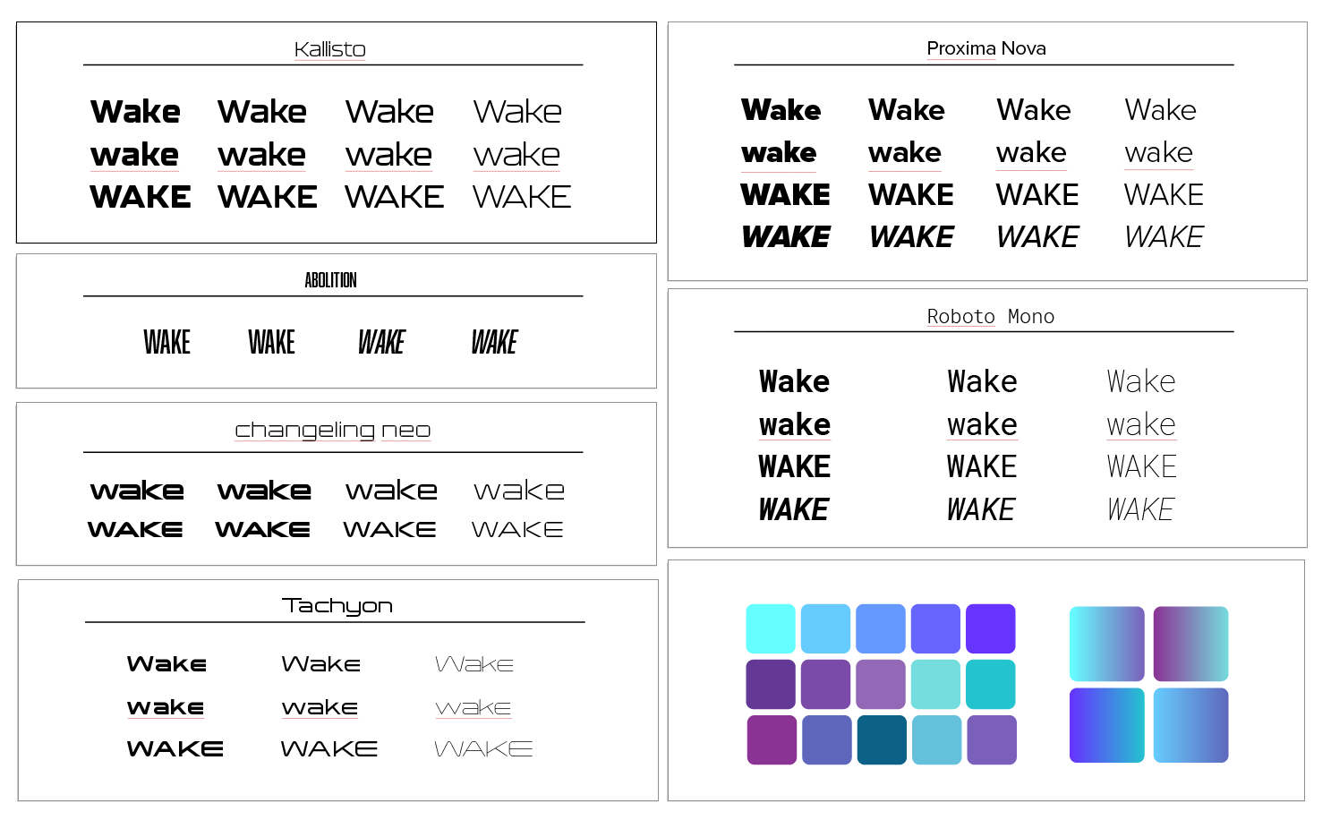
Type & Color Study
Following the rough sketches, I did a type and color study to help refine my direction. The aim was for the font choice to be something that communicated wake was a tech company without being too "sci-fi". The colors were inspired by the vibrancy of the parent company T-Mobile and the pallet of ocean wakes.
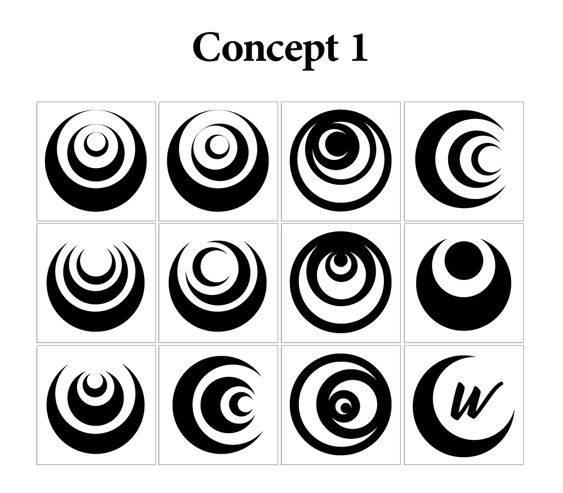
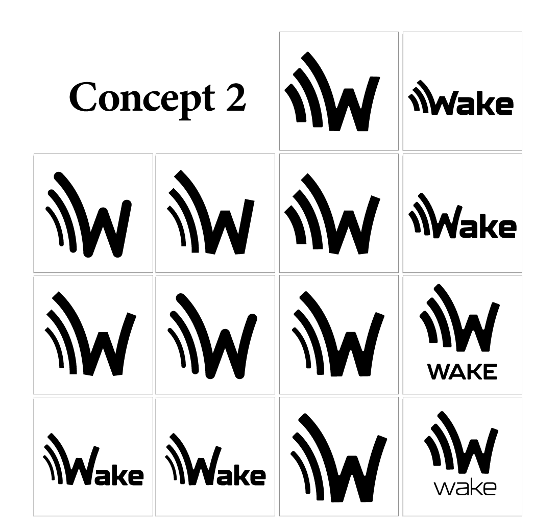
Logo Mock-Ups
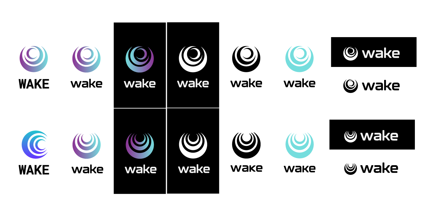
After my type and color study I circled back to the logo sketches. I used two concepts from the sketches to create rough mock-ups of the potential logomarks in illustrator. From there, I determined concept 1 was the strongest and focused in on more refined mock-ups of it. Through a series of reviews and iterations I settled on the final logo mark and fine-tuned everything to create the current logo.
Logotype Refinement
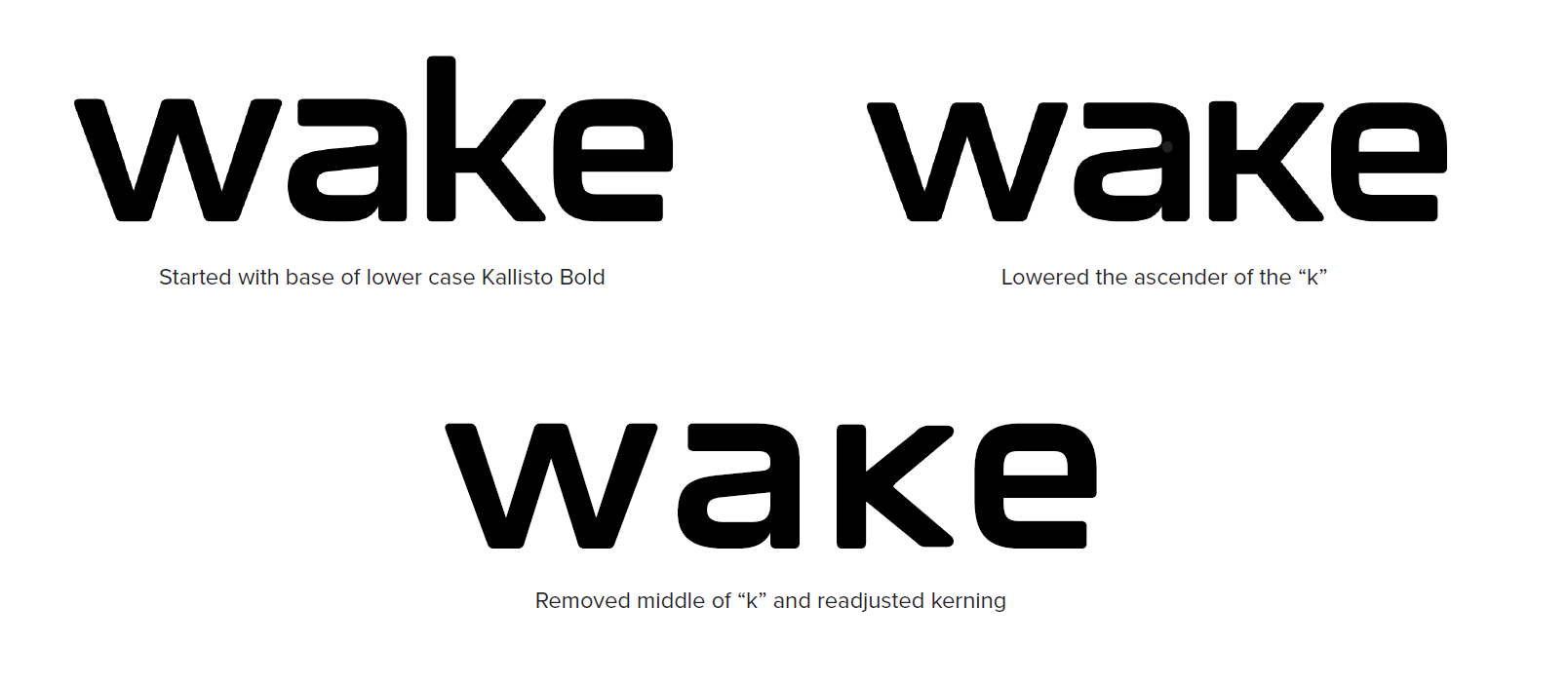
One of the biggest parts of the refinement period was the finetuning of the logotype. In order to seem more approachable, the logotype was set in lowercase, but it was important to get all the x-heights the same for easier alignment with the logomark.
BRAND GUIDE
The project concluded with the creation of a living brand guide. This was intended primarily for use by for the greater wake team and affiliates to help outline what the brand stands for and looks like in practice . It was also created to be flexible and adjust with the times, hence a "living" brand guide.