
BLOSSOM COMMUNITY MARKETPLACE
A Sustainable Grocery Model For Everyone
Featured in LWTech BASD Lost In Space Show
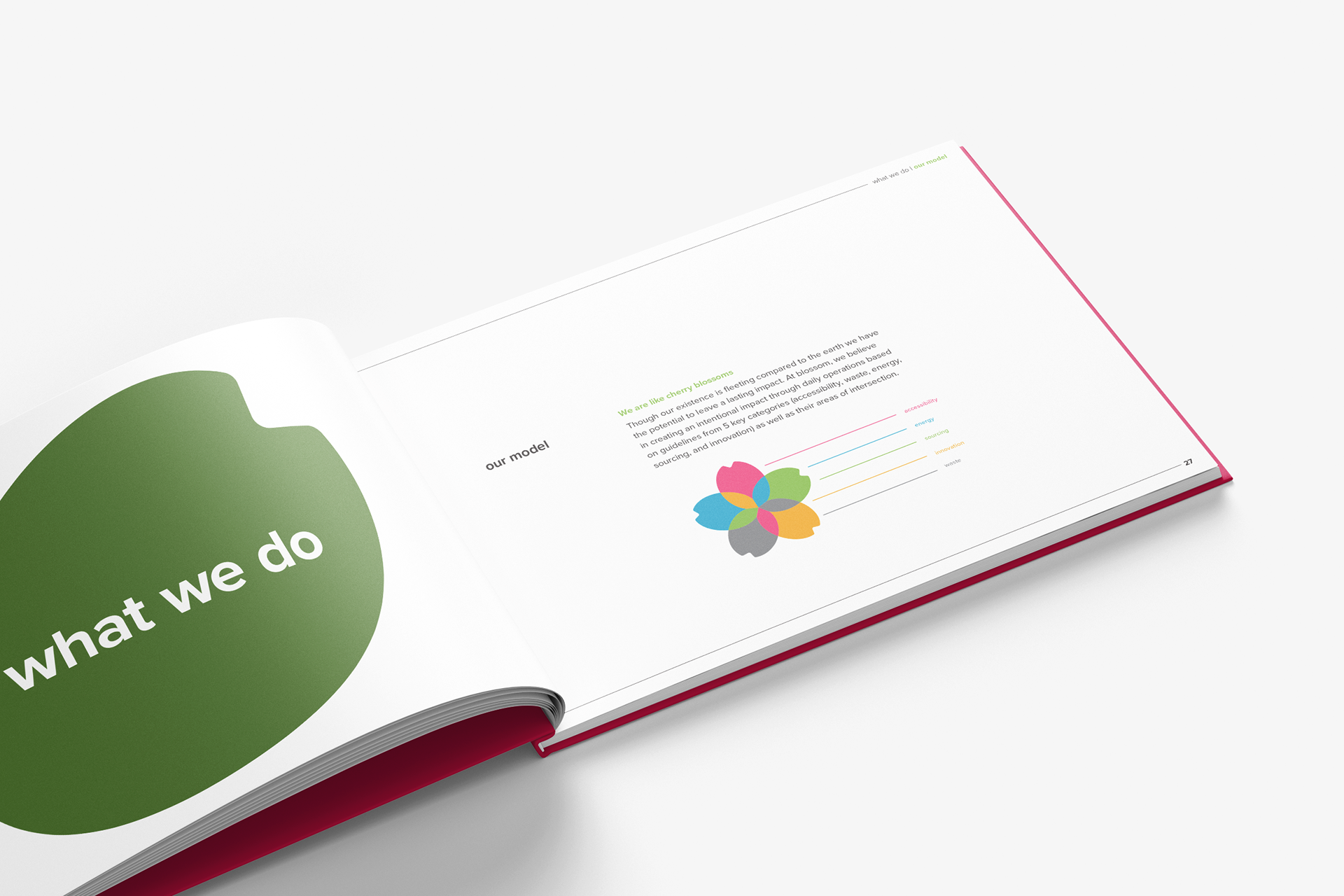
This project was an exercise in designing for behavioral and systematic change through branding. The goal was to investigate the grocery industry, determine what might be hindering “zero-waste” models, and then design a potential solution in the form of a hypothetical brand. Throughout my research, I realized that the term “zero-waste” was typically more of an ideal than a literal goal within the industry. I found that the idea of eliminating packaging was not feasible nor equitable in practice, however, a sustainable model with cycles of reuse and minimal waste was.
***The following is a highly condensed case study of this project. The full process book can be found a the end of this study for a more in-depth look at the project.
PROCESS WORK


Research
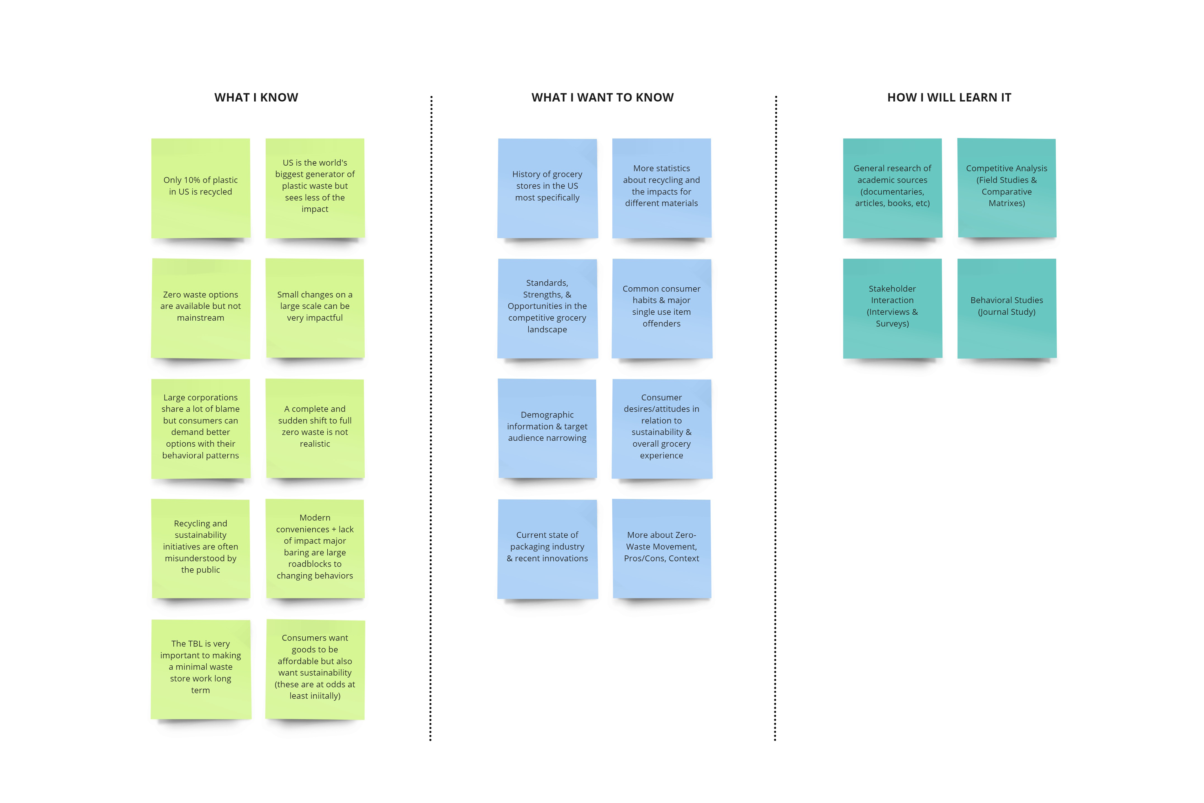
From the start, I knew that tackling the problem of scalable grocery store sustainability practices would not be simple or easy. With this in mind, I determined a high level of research would need to be completed before I could start designing anything. I started this process by creating a plan using the KWHL model. This gave me a basic idea of the methods I might use for collection and how I might analyze my findings later on.
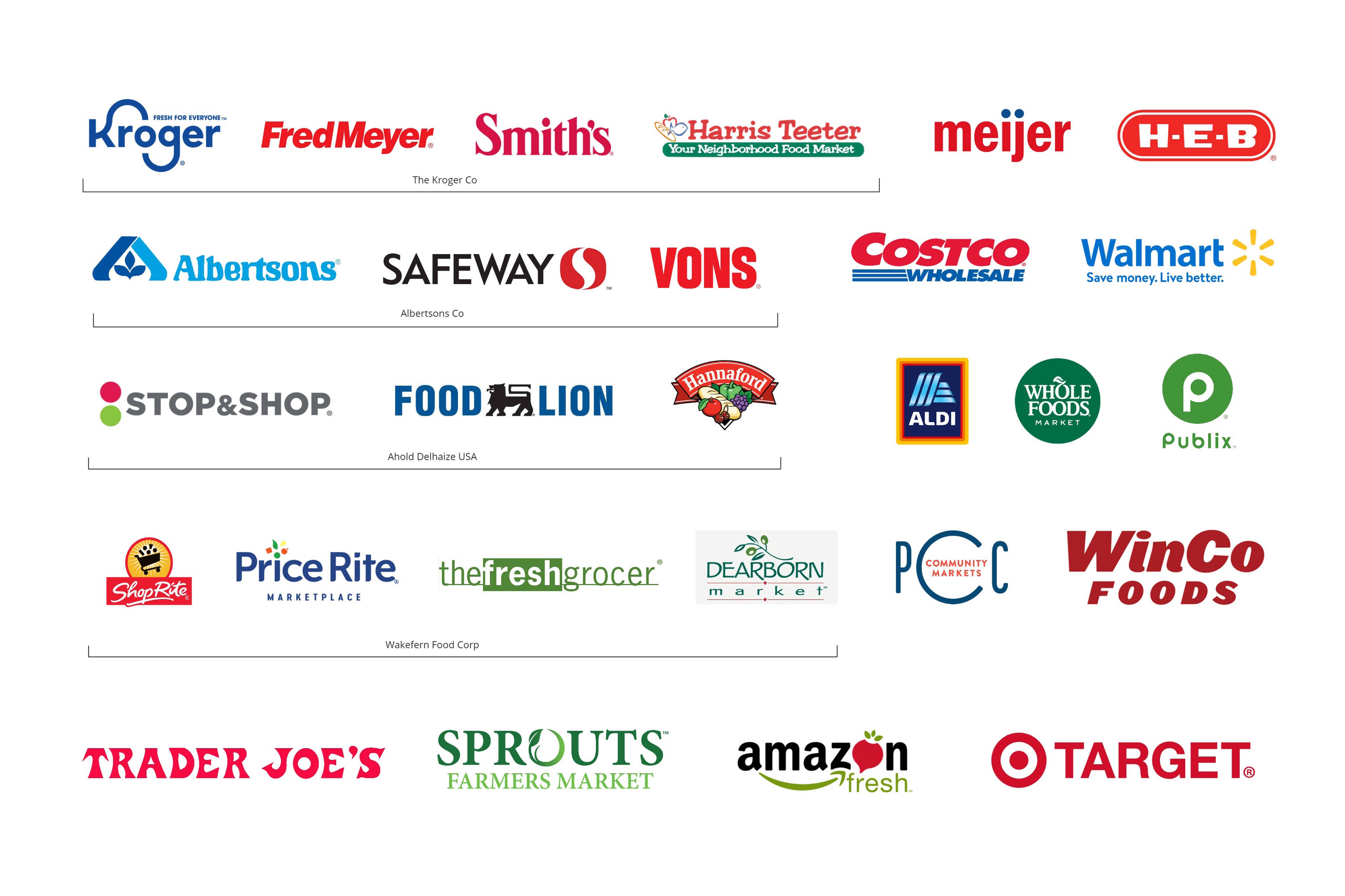
From there, I conducted several research methods including field studies, academic research, and industry benchmarking. I analyzed all the data I had collected via an interrelationship diagram and created customer personas as well as design approach recommendations for a business model, visual identity, and brand essence.

Design
Utilizing the design approach recommendations, I finally began the process of building a brand. I settled on the name Blossom because it was representative of an intersection between biomimicry and cycles of renewal. I then developed a brand strategy guide which helped me define vital aspects like purpose, promise, positioning, and more.
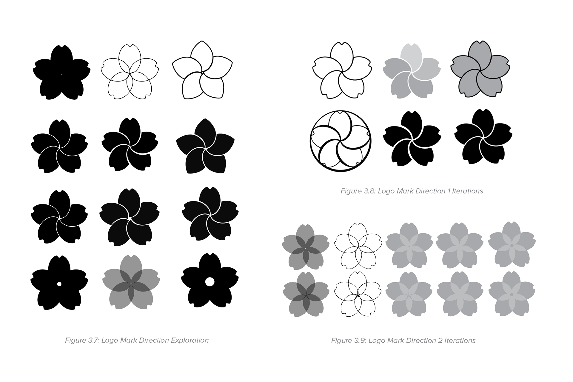
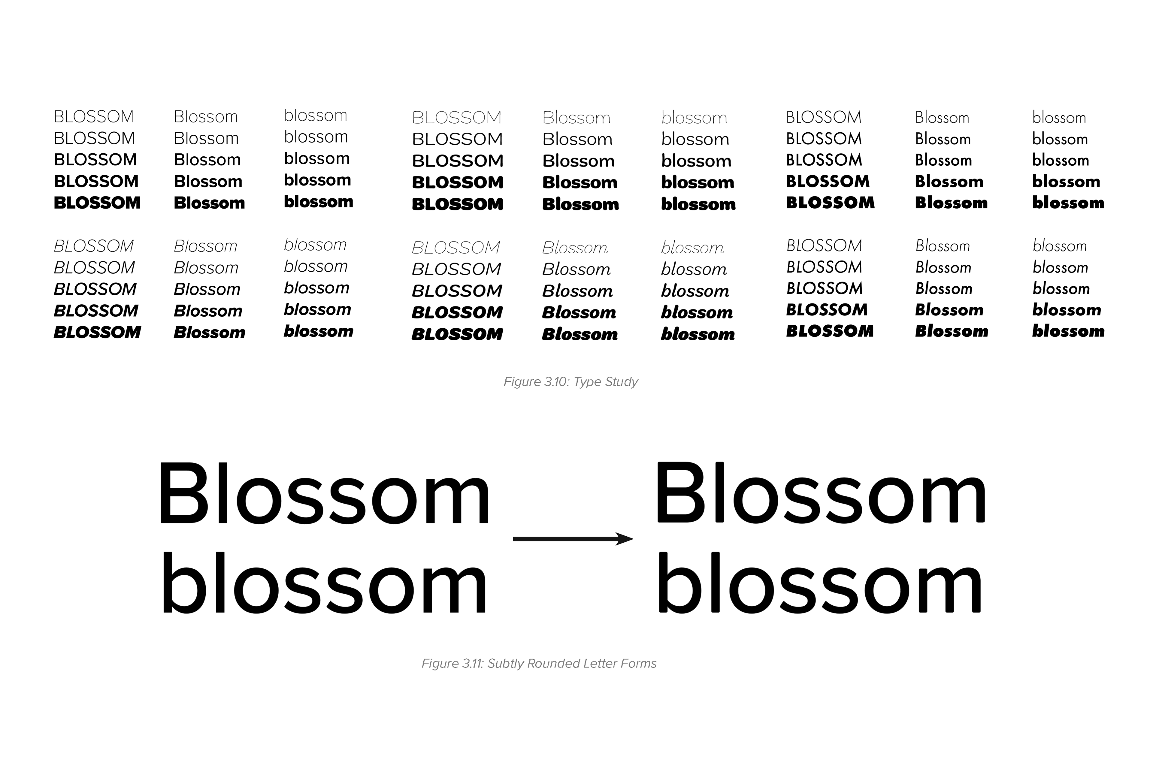
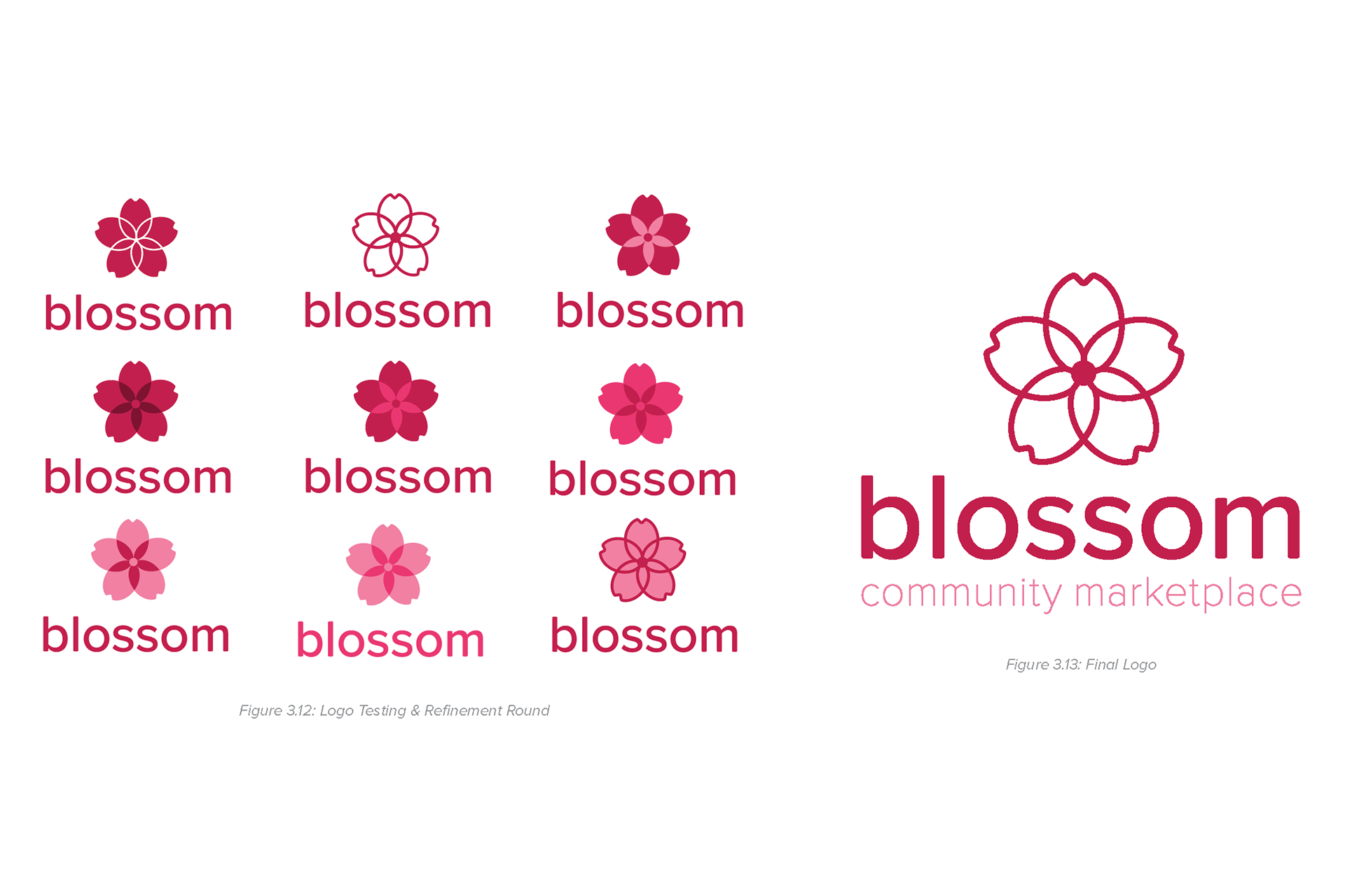
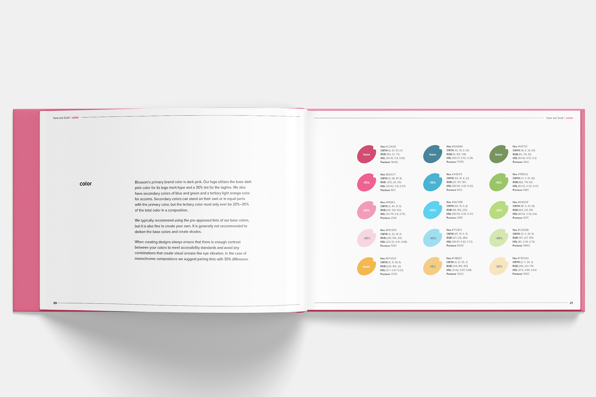
I began crafting the visual identity for the Blossom brand by investigating the visual syntax of cherry blossom forms, both natural and designed. I then thumbnail sketched some initial concepts and moved into illustrator to mock up the more promising ideas. Colors were initially sampled from photography and refined over time. I also conducted a type study to determine the best fit. I ended up going with a humanistic font to achieve a uniform x-height across the top as I felt this set better. The final visual identity was determined after many rounds of iteration and feedback.
I began crafting the visual identity for the Blossom brand by investigating the visual syntax of cherry blossom forms, both natural and designed. I then thumbnail sketched some initial concepts and moved into illustrator to mock up the more promising ideas. Colors were initially sampled from photography and refined over time. I also conducted a type study to determine the best fit. I ended up going with a humanistic font to achieve a uniform x-height across the top as I felt this set better. The final visual identity was determined after many rounds of iteration and feedback.
FINAL DELIVERABLES

Branded Assets
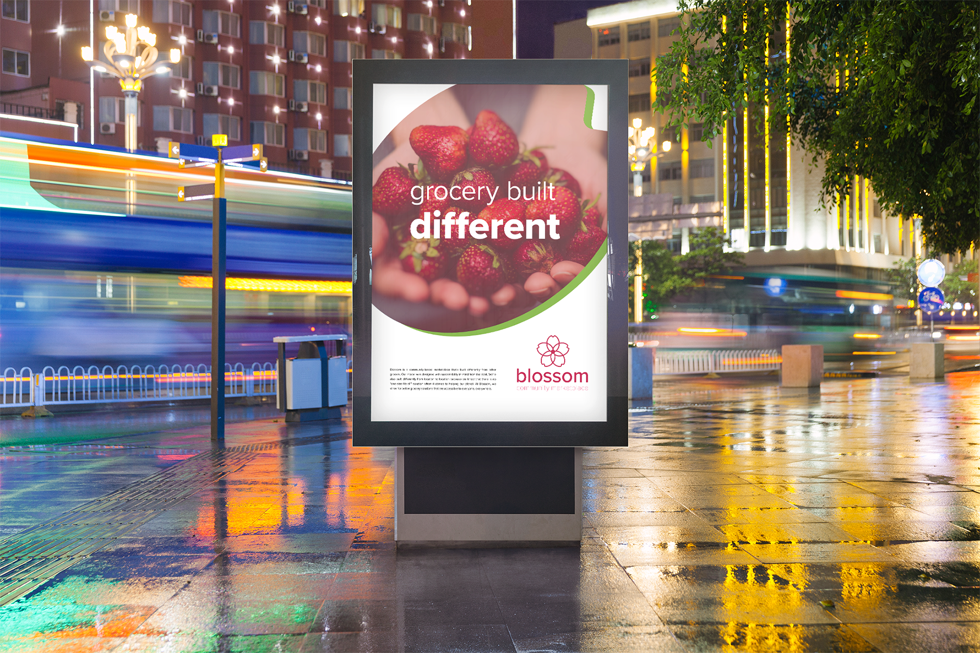
My project culminated in the finalization of my brand guide (click here for full guide) and creation of the trade show poster. All of the research and design refinements were reflected in this final guidebook. The trade show poster was created to test out how all this brand work could be used on a real communication objective.
Full Brand Book
Select pages of the brand book were included in the mock-ups above. Look through the embedded pdf for the full guide.
Process Book
This project required a large amount of research and refinement to get a polished product. Look through the process book for a more in-depth exploration of the entire process..
Credits
Instagram Carousel: Mock-Up Base from Freepik