BIG BELLY REDESIGN
A Collaboration With The City of Kirkland & Waste Management
This project was a collaboration with the City of Kirkland Recycling Team (COKRT) with funding from Waste Management. We were tasked with creating a new wrap for the Big Belly trash compactors in the downtown Kirkland area that fit within a set of requirements including the ability to complement their surroundings (not be gaudy or provocative), be politically neutral, have environmentally themed and locally relevant content, and maintain relevancy for at least 10 years. I worked alongside my colleagues Rebecca Fletcher and Asha Thomas to produce our pitch, which became one of two selected for print by the COKRT. The wraps are currently being prepped for production and will be displayed in the fall of 2022.
RESEARCH
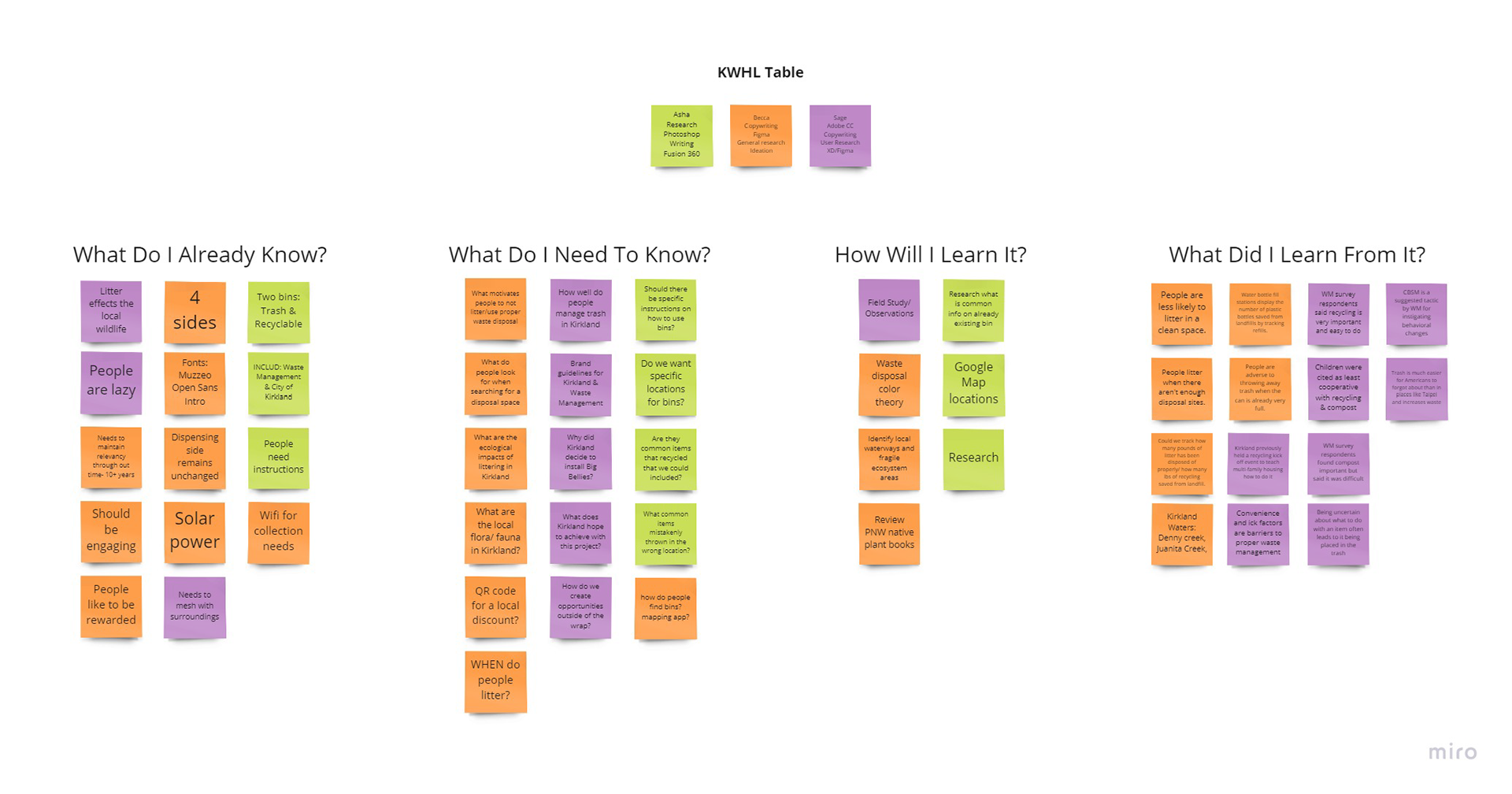
KWHL Chart
Discovering Our Context
We began our process by creating a research plan using the KWHL model. This allowed us to get a better idea of what we would need to research and how we wanted to go about getting the data. We collected our initial research primarily from articles on the subject matter, past studies that had been done by Waste Management, and a site analysis of the current bin locations. We later supplemented this information with some stakeholder interviews and competitive benchmarking by evaluating how other counties, states, and countries handled their waste management.
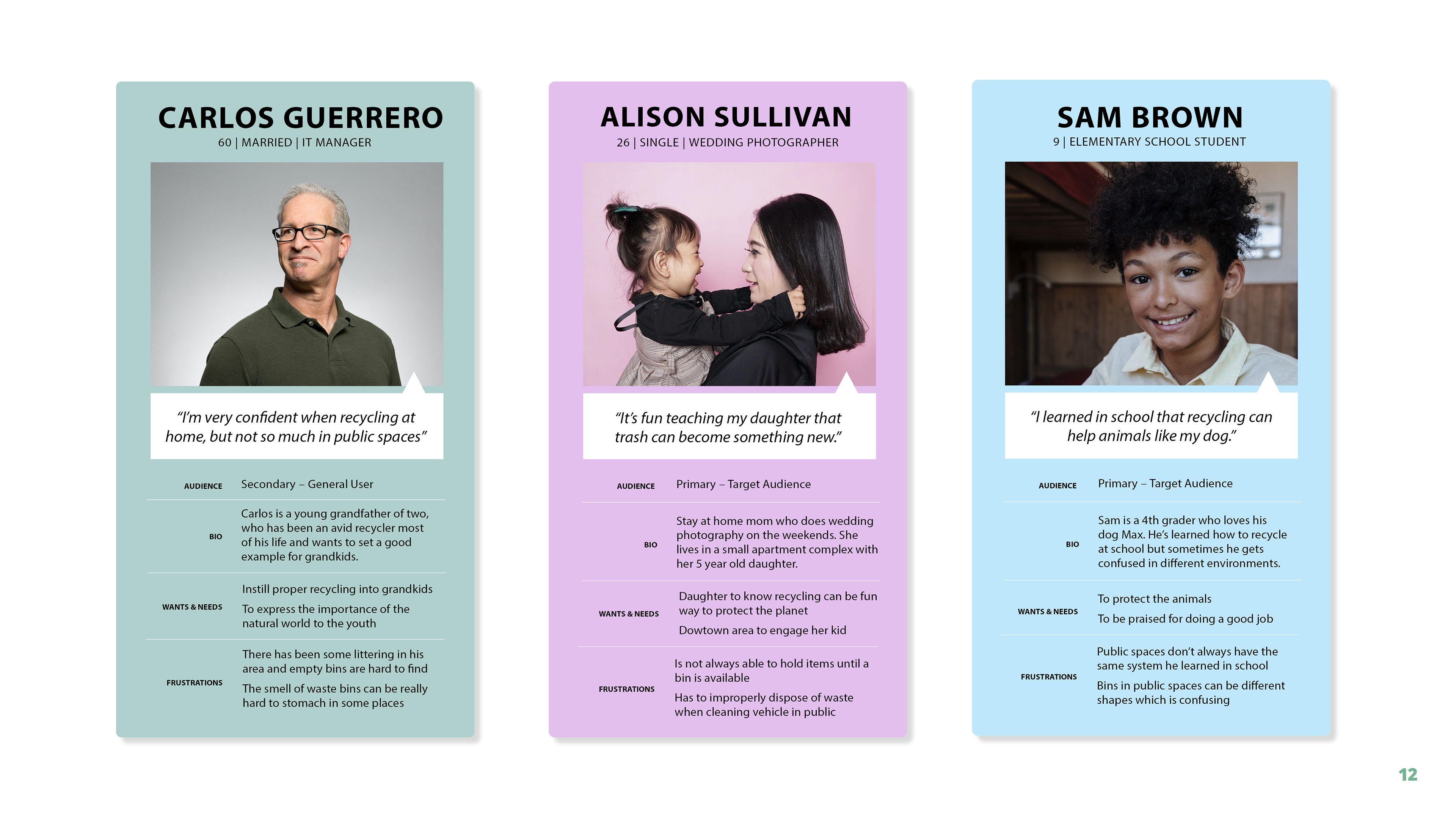
Target Audience Personas
Selecting A Target Audience
The culmination of our research led to the establishment of parents and young kids as our primary audience. We believed involving the next generation of waste managers was imperative to creating a better future in line with Kirkland's sustainability goals.

Flora & Fauna Color Samples
Designing For Empathy & Aesthetics
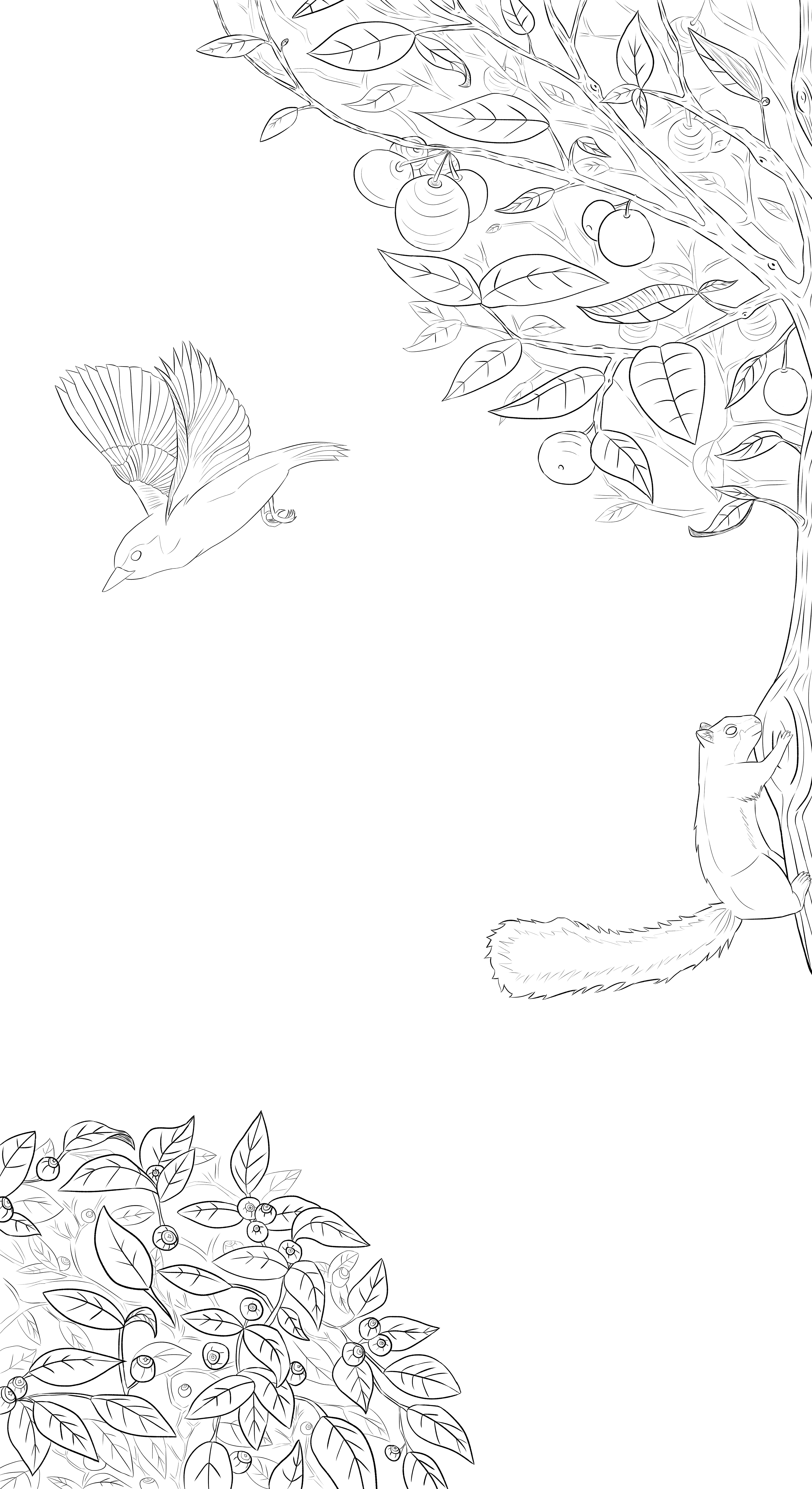
A key finding in our research was that empathy was key to better waste management and environmental conservation, especially with children. We decided to incorporate local flora and fauna into our design so that the entire community could remember what they were protecting by properly disposing of their waste. The selected species were divided into forest and wetland groups for trash and recycling respectively. This paired effectively with the designated Kirkland bin colors of green for trash and blue for recycling.
DESIGN PROCESS
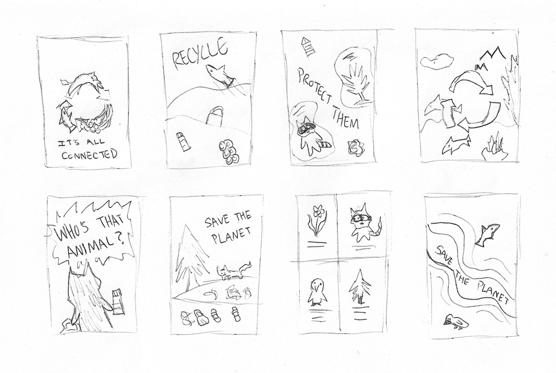
Sage's Crazy 8 Rapid Sketches
Rapid Iteration
To start the process of designing the wraps my group and I conducted Crazy 8 Sketch exercises. This helped us to rapidly iterate ideas. It was decided that I would be handling the wrap illustrations and layouts, while my group members focused on creating an education app to pair with the design.
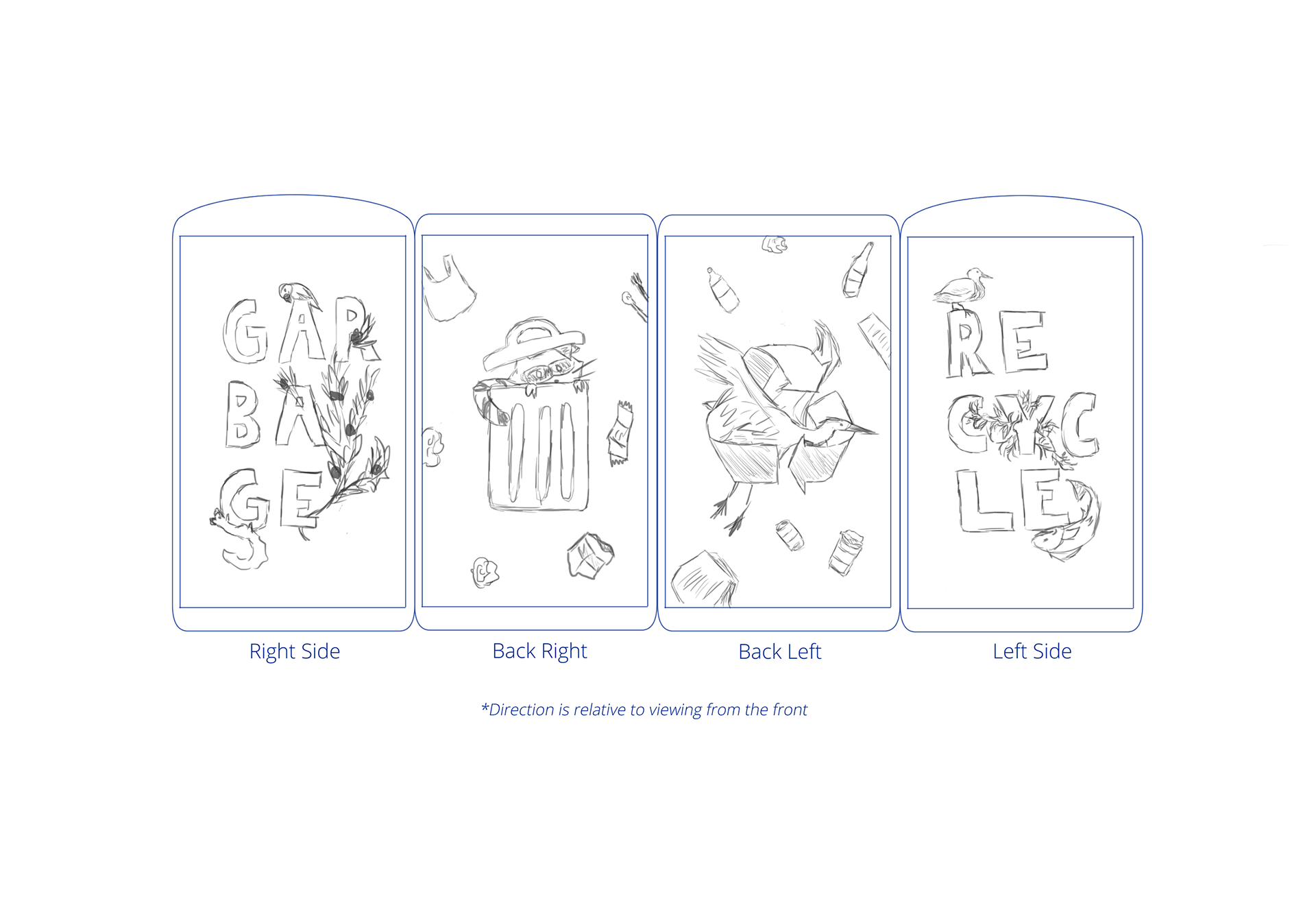


Rough Concepts
After reviewing my rapid sketches, I went on to create some rough concept layouts. I also created rough colored examples to share with our COKRT contact during a check-in meeting. The goal was to create a design that would appeal to our target audience and provide a learning opportunity while also beautifying the Kirkland street front.


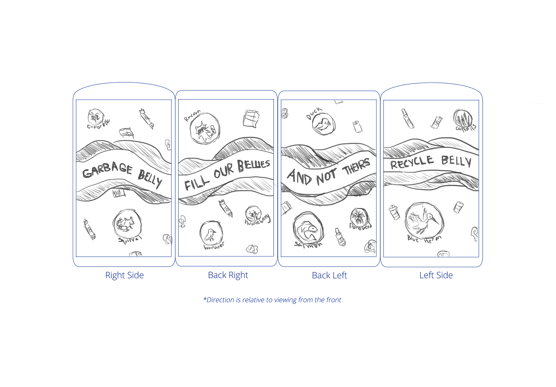
Sketches & Line Art
Once we selected a layout based on feedback from our COKRT contact, I began the process of sketching. We had originally intended to go with a flat art style to appeal to kids but pivoted to a more realistic watercolor style after receiving feedback on the initial sketches. From there I created refined line work and went on to paint the final versions.
FINAL DELIVERABLES
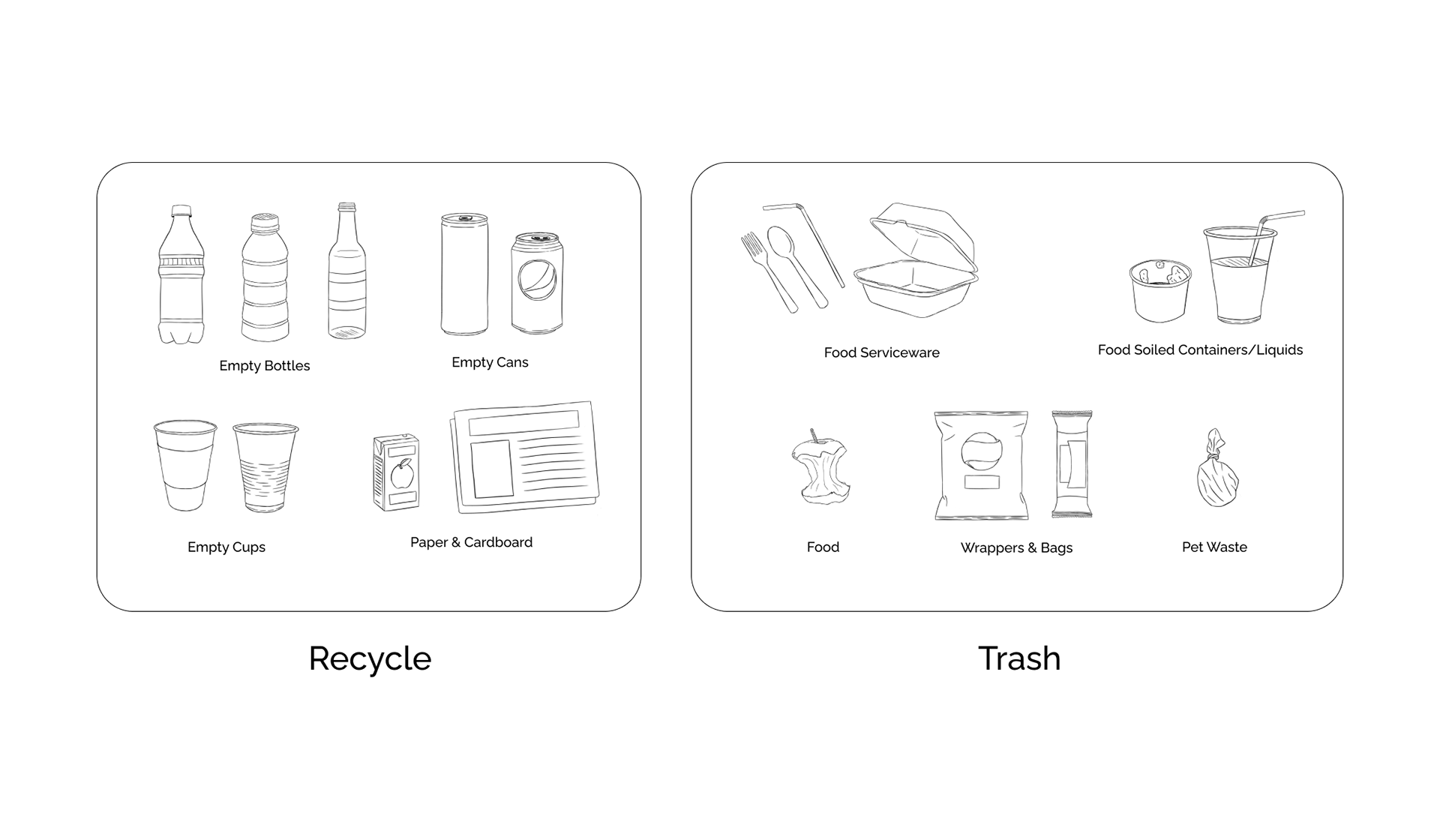
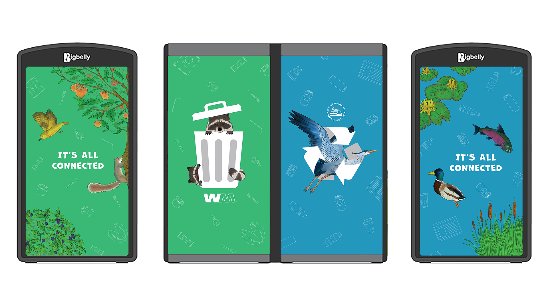
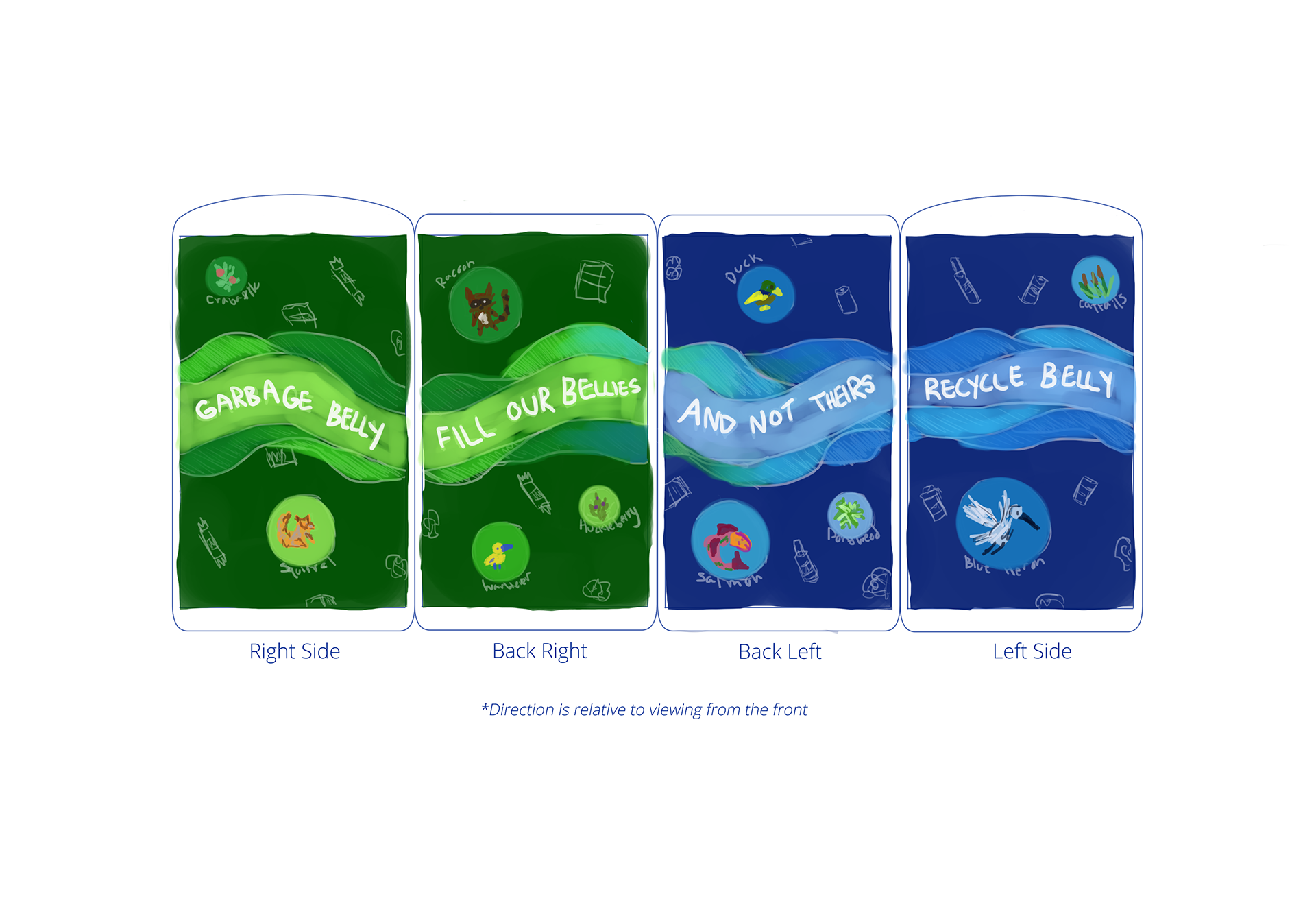
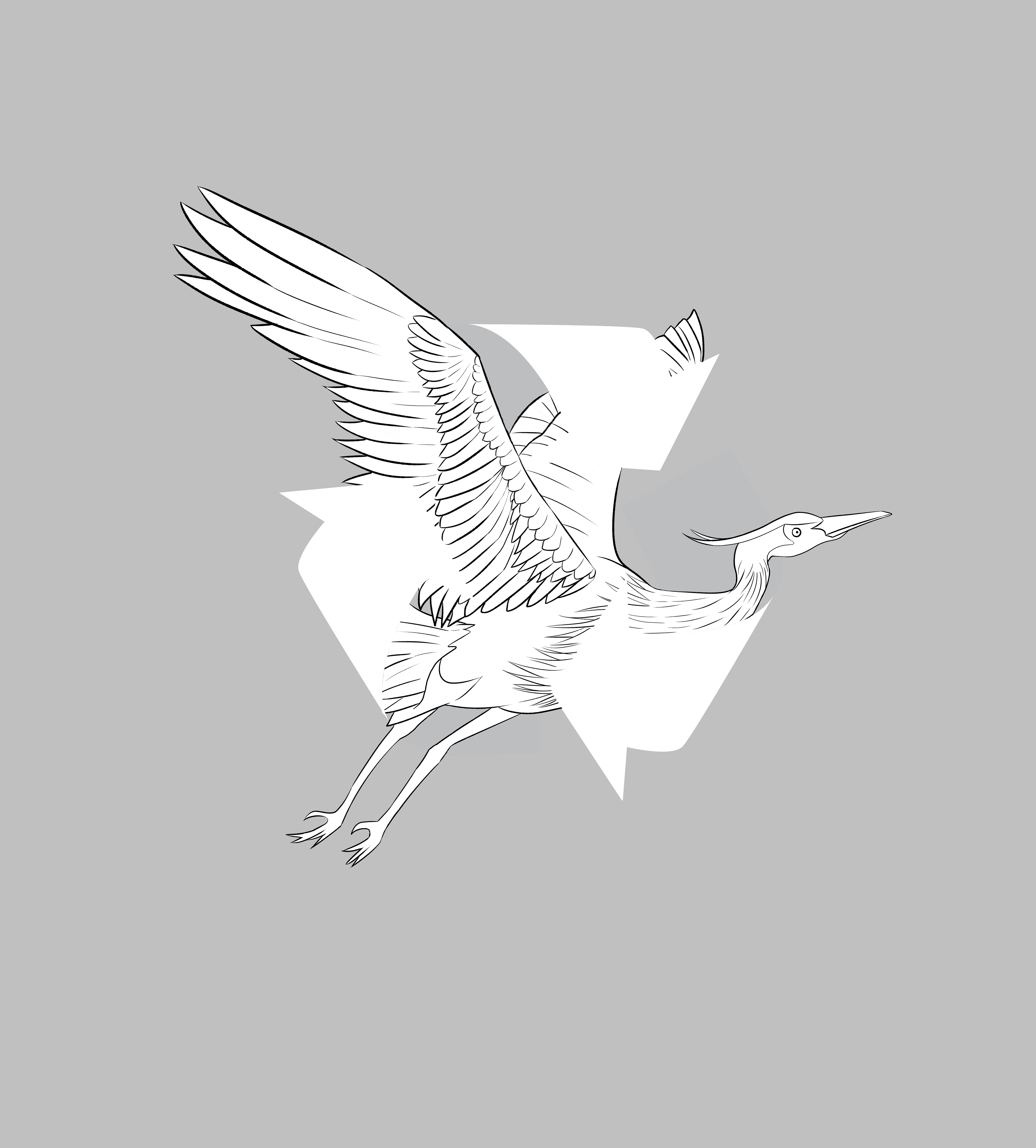
Trash & Recycle Icons
We placed hand-drawn icons featuring the acceptable forms of waste for each bin type throughout the design as a subtle reminder of what to dispose of in them. This was supplemented with city-provided instructions on the front paneling.
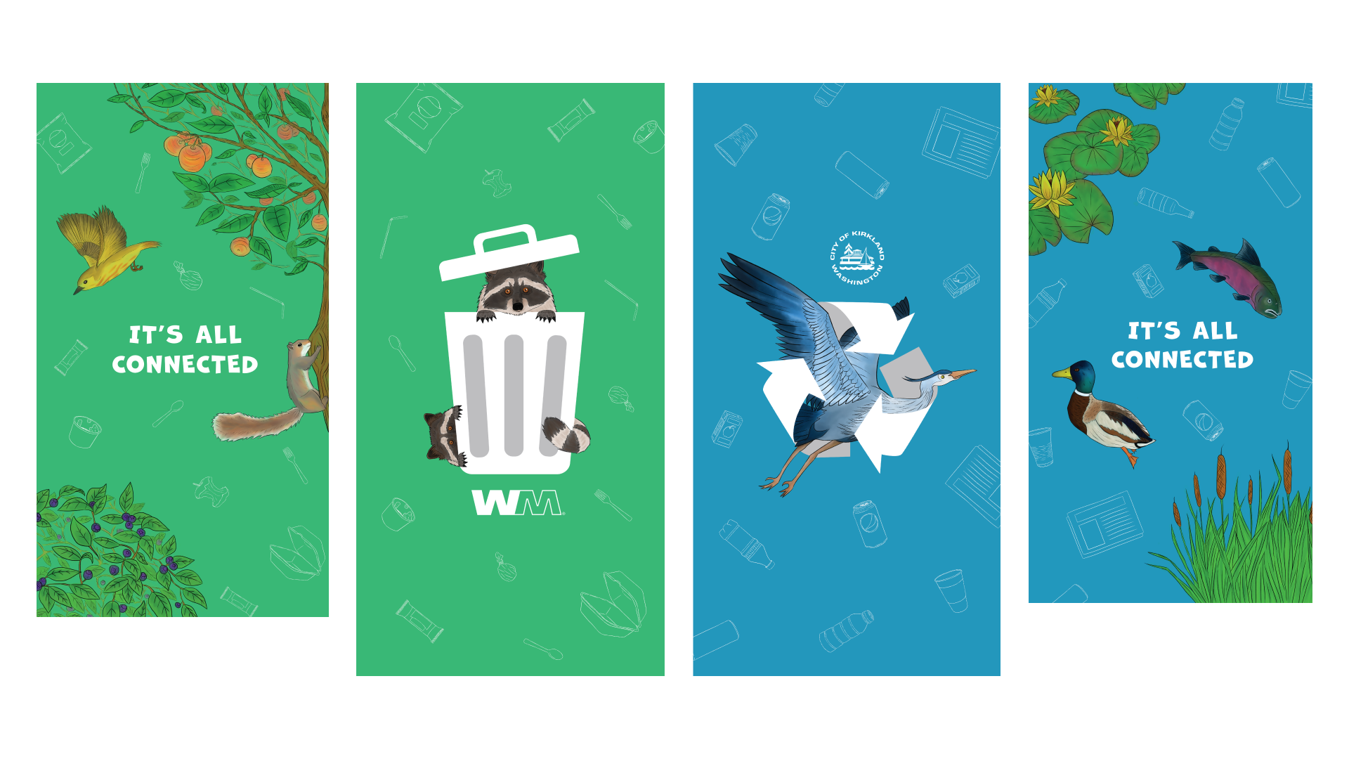
Final Layouts
The final bin wraps featured hand-drawn icons with painted flora and fauna images. To ensure the bins would not be confused for electrical boxes or anything else from afar, the trash and recycling were sized as prominent features.